View Poll Results: Do you think the banner should be changed?
Yes


18
69.23%
No


1
3.85%
who cares


7
26.92%
Voters: 26. You may not vote on this poll
forum banner pic
#11
 03-19-2010, 11:41 AM


Join Date: Dec 2009
Location: Lakewood, Ohio
Posts: 144
Likes: 0
Received 0 Likes
on
0 Posts
i think thats an awesome idea
#13
03-21-2010, 08:45 AM

Senior Member & 2010 ROTY

#15
03-23-2010, 01:19 PM

Senior Member & can cook minute rice in 58sec
Join Date: May 2009
Location: northern ireland/ulster/UK
Posts: 450
Likes: 0
Received 0 Likes
on
0 Posts
1 if it looks like a 4wheeler,get glasses
2 it aint broke so,,,,,
3 if you don't like it,,,,,,,,
4 boss has enough to do
5 new members need whipped to within an inch of their lives in rubber gear and ,,,,
6 i'v too much time on my hands
7 this has run-a-muck
8 my misses is as ugly as yours
9 no pics
10 number 8 might be wrong, i don't know your misses

#17
07-29-2010, 05:01 PM

Banned
Join Date: Jul 2010
Location: Los Angeles
Posts: 4
Likes: 0
Received 0 Likes
on
0 Posts
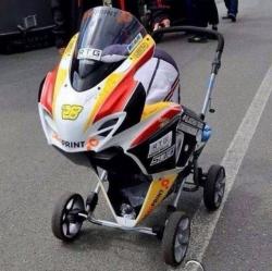
I propose a change in the banner pic, i dont mind the bike thats used i just dont think that angle looks that great, for awhile i thought it was a 4 wheeler, mainly cause i only ever gave it a glance then scrolled down real fast. i realize what it is now. but if the bike was moved up higher or maybe more of a diagonal shot as opposed to a side shot might look better.
what do you guys think?
what do you guys think?
i hesitated a little to make sure i was in the right forum when i first saw the banner... it really doesn't seem professional enough, and the reason i care cause this forum represents us as the cbr riders, and i wish it'd be a little more professional...
#18
07-29-2010, 10:32 PM

Administrator - Retired
But what would be really cool would be have like the Classic one on the left and a few inches to the right have the 2010 and in between the two have the other models morphing into the 2010.
I honestly don't mind the way it is now.
yeah, i hear what you're saying, especially when look at it from a designer's perspective, the above banner looks like junk... and the typeface chosen for "CBRforum" seems like any high school kids w/ no real graphic design education can do it... it's a forum for cbr, at least give us a feeling of "speed", it doesn't feel fast at all... the only feeling that i get is "artificial" and the shadows of the bike made it seem like it's going backward instead... the background is like whatever...
i hesitated a little to make sure i was in the right forum when i first saw the banner... it really doesn't seem professional enough, and the reason i care cause this forum represents us as the cbr riders, and i wish it'd be a little more professional...
i hesitated a little to make sure i was in the right forum when i first saw the banner... it really doesn't seem professional enough, and the reason i care cause this forum represents us as the cbr riders, and i wish it'd be a little more professional...
First you complain about the sales rules in the official rules thread....THEN you post 2 for sale ads inside other people's threads.... then you come here and bash the site designers.
Enjoy your "time out".
And for the record, we don't care what you think of the rules or the site.
Your behavior doesn't seem professional enough, and I don't like the way it represents us CBR riders.

Last edited by kilgoretrout; 07-29-2010 at 10:59 PM.
#20
07-30-2010, 11:32 PM
The Maxwell hammer was poised, but I got beaten to the hammering by a Trout.
Got what he deserved........... Muppet.......(sorry Kermit)
Oh and Quote
1 if it looks like a 4wheeler,get glasses
2 it aint broke so,,,,,
3 if you don't like it,,,,,,,,
4 boss has enough to do
5 new members need whipped to within an inch of their lives in rubber gear and ,,,,
6 i'v too much time on my hands
7 this has run-a-muck
8 my misses is as ugly as yours
9 no pics
10 number 8 might be wrong, i don't know your misses
Blaziken for supporter of the week !
Last edited by Shadow; 07-30-2010 at 11:35 PM.