
opinion


Thread Starter
|
Member
Joined: Jan 2008
Posts: 56
Likes: 0
From: New mexico
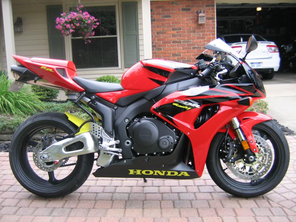
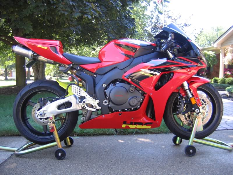
hello my name is jeremy. I decided to paint up my lowers to match my bike. My bike is the candy pheonix blue. I ordered decals online with the yellow lettering. I believe it brings out the paint scheme. To me the bikes looked unfinished with the black lowers. Let me know what you all think. Good idea or bad..
[IMG]local://upfiles/23629/C36B01576B694B639D6D8FF2A18CAF93.jpg[/IMG]
[IMG]local://upfiles/23629/A24D02A78A5D4F319C9EA0B7538F0049.jpg[/IMG]
[IMG]local://upfiles/23629/C36B01576B694B639D6D8FF2A18CAF93.jpg[/IMG]
[IMG]local://upfiles/23629/A24D02A78A5D4F319C9EA0B7538F0049.jpg[/IMG]

Jan 2009 ROTM
Joined: Dec 2006
Posts: 5,493
Likes: 0
If you asking for opinions i will give it. I like the blue lowers, looks great. Personally i could do without the yellow honda logo or the pitbull sticker, but thats just personal preferance. Over all i think it looks cool though.


Thread Starter
|
Member
Joined: Jan 2008
Posts: 56
Likes: 0
From: New mexico
yea pit bull stickers are coming off. i went with a different style of lettering. Thought it would bring out the looks. Seems like most people are not liking the lettering. Something new to get used to i guess. O well they are just decals so i can do whatever.


Senior Member
Joined: Aug 2006
Posts: 1,284
Likes: 0
From:
+1.
to the original photo, I like the looks of the bike, but I agree with everone else about the font for "HONDA".
That cbr is full of sharp, aggressive edges and all of the other fonts on the bike come to a point as well. Pick a serrifstyle font and it will look much better.
to the original photo, I like the looks of the bike, but I agree with everone else about the font for "HONDA".
That cbr is full of sharp, aggressive edges and all of the other fonts on the bike come to a point as well. Pick a serrifstyle font and it will look much better.